+- Wings 3D Development Forum (https://www.wings3d.com/forum)
+-- Forum: Wings 3D (https://www.wings3d.com/forum/forumdisplay.php?fid=1)
+--- Forum: Gallery (https://www.wings3d.com/forum/forumdisplay.php?fid=10)
+--- Thread: Thermometer (/showthread.php?tid=1898)
Pages:
1
2
Thermometer - olve11 - 04-21-2016
Hello everyone.
I want to share with you my new work.
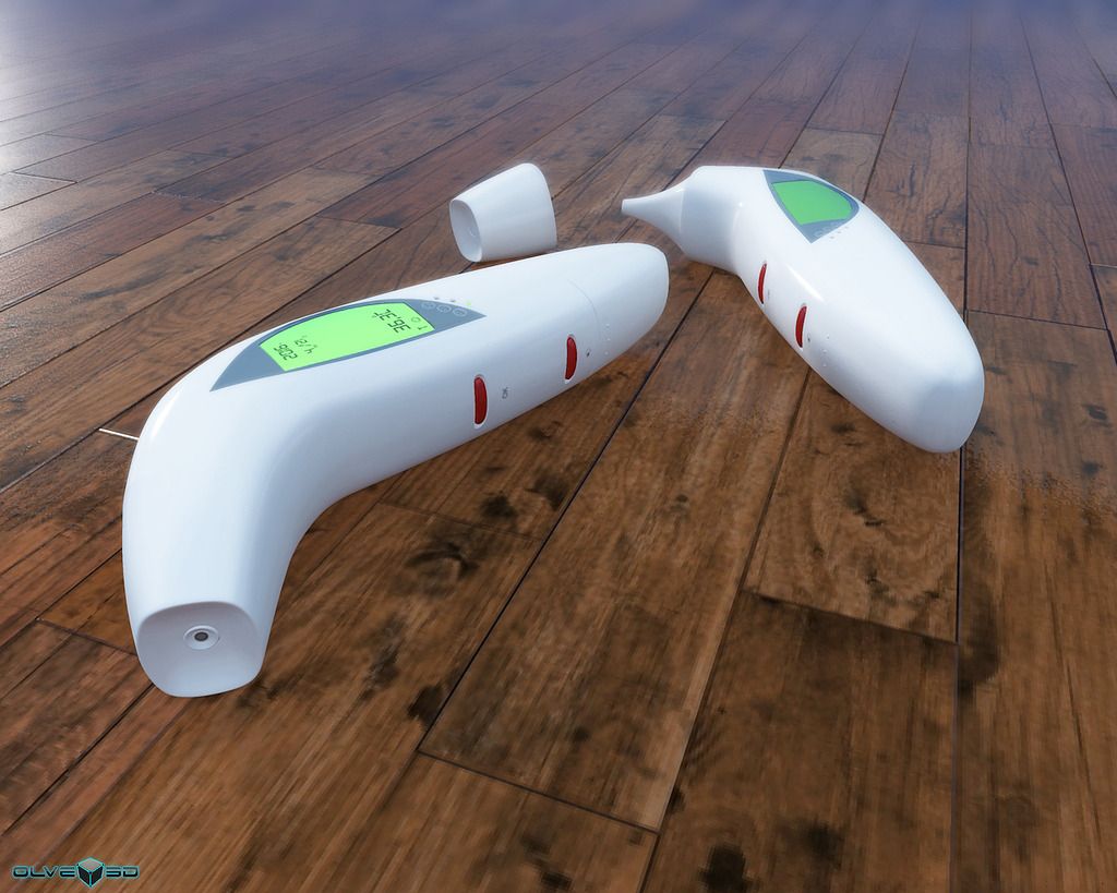
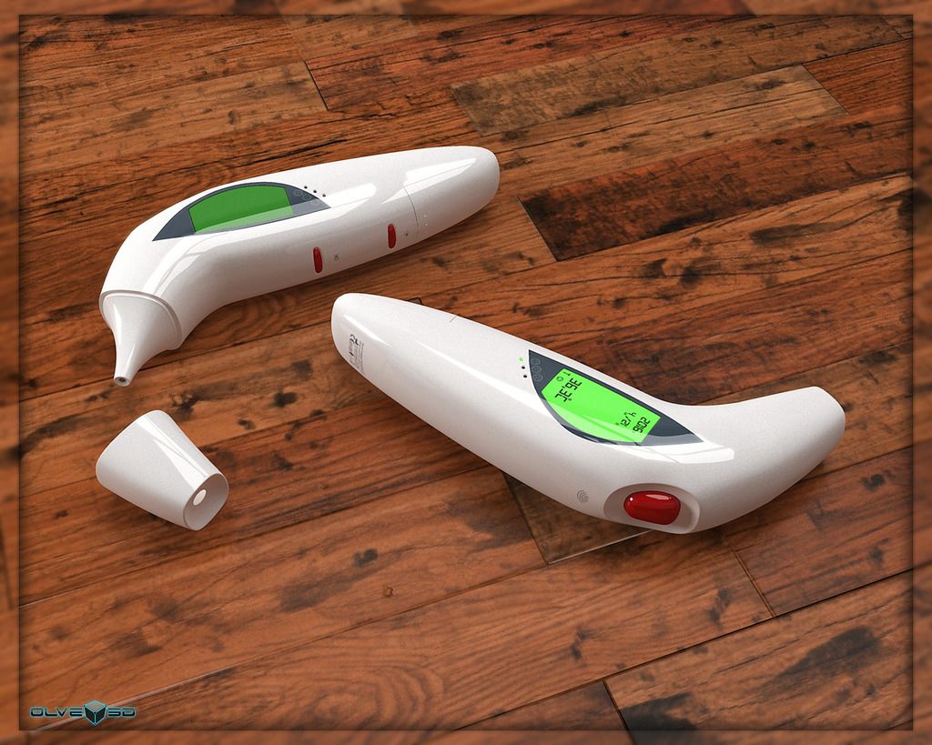
My own thermometer.
enjoy
Wings 3D (x64) 2.0.1.2016-03-17---00-21.mlab (booleans) - modeled
(box modeling)
Kerkythea - render
render

soft shadows

wings screenshots


Kerkythea screenshot

RE: Thermometer - micheus - 04-21-2016
Nice model.
About the render, I think if the shadows were not so soft it could look more natural.
It's not a criticize. It's just my thoughts.

RE: Thermometer - olve11 - 04-22-2016
Thanks Micheus
In first render its sun with default setting. (and yes its real)
In second its same sun with soft shadows and radius 40
RE: Thermometer - micheus - 04-22-2016
(04-22-2016, 05:23 AM)olve11 Wrote: In first render its sun with default setting. (and yes its real)Maybe because of that.
As I see a indoor floor with a strong light "entering" across a supposed window or door I expected to see a darker shadow in the opposite side of the object "touched" by the light.
But, observing better the lighting the "glow" upper in the image suggest you were not using a enclosed environment (room), so the "white" sky seems to be illuminating more the scene as I would to expect (thinking in a enclosed scene).
RE: Thermometer - olve11 - 04-22-2016
It is true
In the closed environment it would probably be better results.
And luminous display on the first model (on distance) it would look better.
thanks for the tip
RE: Thermometer - Dimitri - 04-22-2016
The scene needs some neatly shaped shadows. The objects look as if they are floating in the air. You can combine the sun light with other light sources. With some experimenting you can achieve quite nice results by using multiple light sources in the scene.
Also, you have to decrease the diffusion of the thermometers. Less diffusion and more specularity would give much more natural looking results.
And finally, the quartz indicators... they too need some more work. They need to give the impression of being behind a glassy surface.
As to the modelling: no criticism, it is flawless. : - )
RE: Thermometer - olve11 - 04-23-2016
Thanks Dimitri,Micheus

RE: Thermometer - waldo - 04-27-2016
This looks good than your previous photo.
RE: Thermometer - ggaliens - 04-27-2016
Last Render looks just right to me. Nicely done.
RE: Thermometer - cyseal - 04-27-2016
Excellent shape and render.